Meet the Client
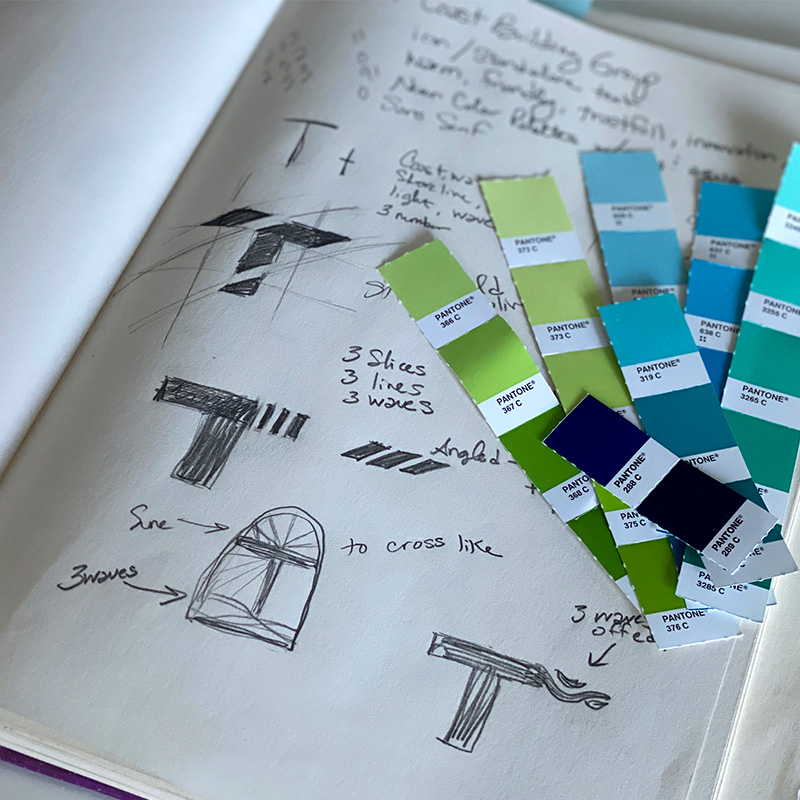
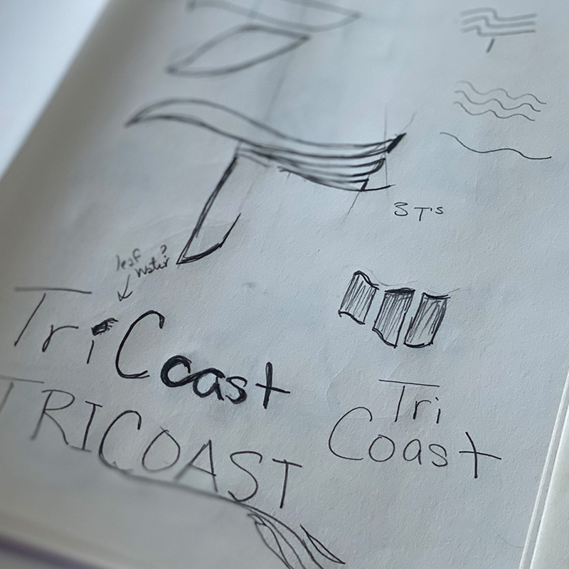
TriCoast Building Group, is a woman-owned, family-oriented construction company specializing in drywall and acoustical ceilings for commercial projects. Rooted in family legacy and industry expertise, TriCoast prioritizes organic growth and exceptional service. Exploring the emotional roots of their name through in-depth conversations. “Tri” symbolizing the strength of three sisters, three generations, and the Holy Trinity, and “Coast” representing calm, creativity, and forward motion. These insights inspired the development of a brand strategy that honors their story and aligns with their vision to be warm, approachable, and innovative.
The FOCUS
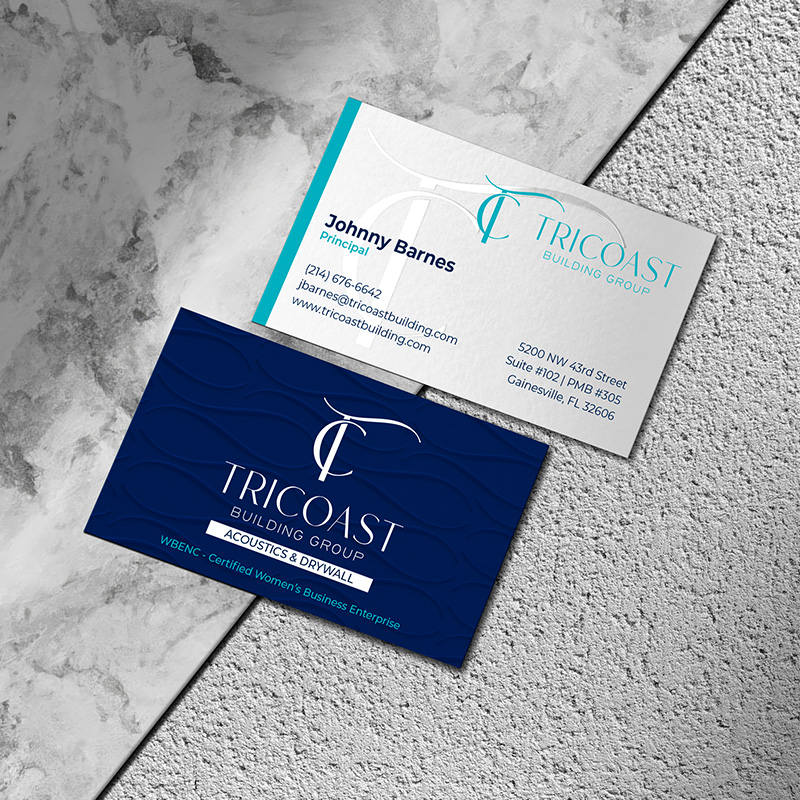
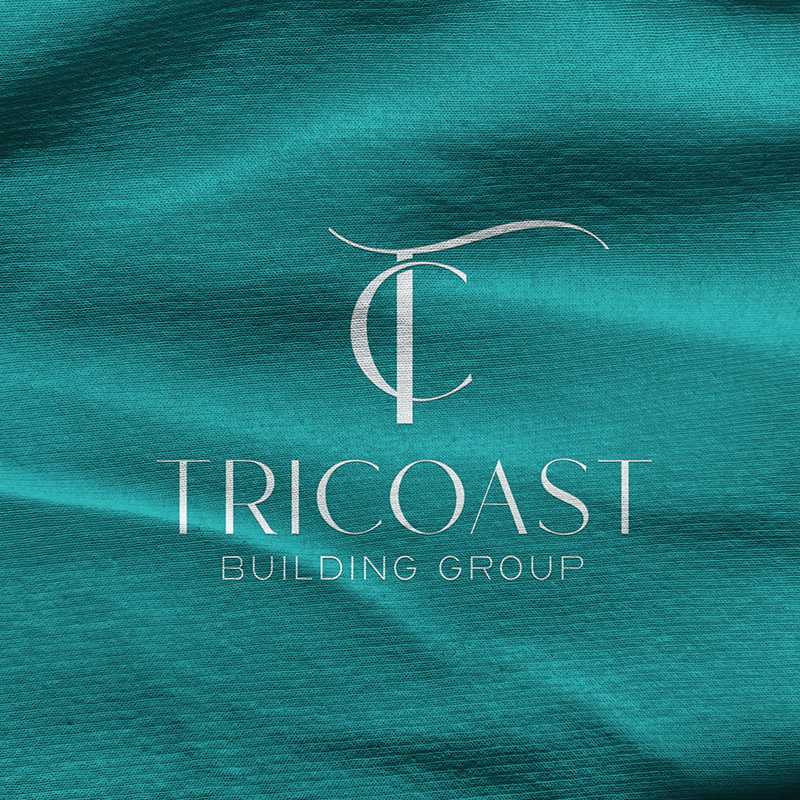
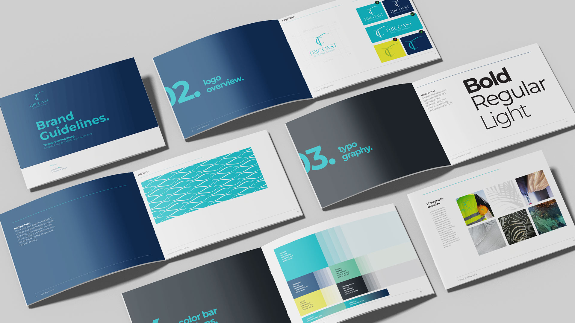
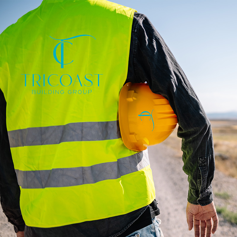
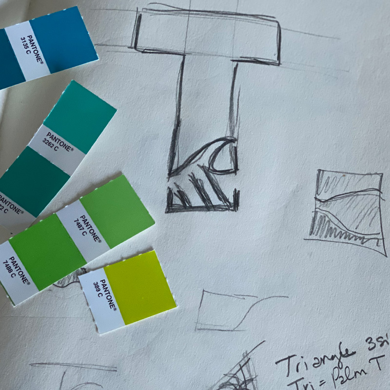
For TriCoast Building Group, we designed a distinctive brand identity that sets them apart in the male-dominated construction industry. We chose cool tones like teal to replace the traditional navy and red, evoking trust, creativity, and approachability. The feminine, motion-inspired font reflects innovation and professionalism. We created comprehensive brand guidelines, including logo usage instructions, and provided sample photography and mood boards to guide future visuals.
The result is a distinct, forward-thinking brand that captures TriCoast’s dedication to excellence, creativity, and lasting client relationships. This new identity not only reflects their core values but also establishes them as an innovative, modern leader in the construction industry, poised to break barriers and lead with authenticity and purpose.
